I find it really hard to visualise a card but I do know what I like and what I don't like, what colours appeal or not as the case may be (excuse the pun!)
If it weren't for all those talented people out there my cardmaking would come to a full-stop so thanks for sharing your creativity with me and allowing me to case and adapt your ideas.
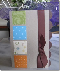
Saw this card on Kristina Werner's blog and as I had just received my new square punches, had to try them out.
Couldn't exactly match the patterned CS that she used but think it looks pretty close.
Also had to use my 1" circle punch rather than the smaller (I think she used the 3/4") punch but it still gives the same scallop effect.
Kristina is certainly one very talented young lady.
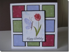
Loved this card as soon as I saw it and of course, I could once again utilise my square punches! I was able to use the DSP in the small pallet of designer papers that was a special May offer from SU.
I didn't have the stamp set used in the original but thought that Garden Whimsy looked great on the front. This card was cased from Julie Buhler - http://paperpleasing.typepad.com/my_weblog/2008/06/sparkly-sketch.html?cid=120133010#comments
I only case for my personal use and would never use someone else's original design to submit cards in challenges or to magazines etc.


0 comments:
Post a Comment